drawing backgrounds: omoulo's master blog
contents
introduction
concepts and research
thumbnailing
- perspective crash course
- composition
- foregrounds
- back to the drawing
sketching and detail
- technical aspects of drawing detail
- deciding on detail
lineart
- dynamic lineart
- detail in lineart
- avoiding confusion in lineart
colour and light
- drafting
- unusual colour palettes
- detail with colours
- technical tips to accurately create light and shadow
finalisation
final examples and analysis
other
- portfolio/practice advice
involving characters
hello everyone
so a while ago my good friend the almighty spongest asked me for some advice on drawing backgrounds, and while looking through all my notes and references i thought to myself fuck it lets spread the knowledge and shit...
to get this out the way, in this blog i will be using the work 'background' to refer to any kind of drawing that isnt of a focused on a living figure, rather it aims to tell a narrative or story through a specific environment. this includes backgrounds drawn in animation, video games, and comics (perhaps otherwise referred to as layouts or environments), also general illustration that may later involve a figure as the focus or not, and also artwork where the sole intention is to portray a landscape or environment. im just going to use the word background as i feel like those reading will be from an illustration or animation background and so the word will be easily understood in that context....
as for me, i love drawing backgrounds - or more specifically, highly detailed illustrations of usually quite mundane environments - more than i do drawing actual people. i think we gravitate more towards illustration with people in it because its obviously easier to directly relate and convey emotion, but for me there is something exciting about being able to convey feeling, messages, or character/culture of a person/group using an image of a space without one present in it. after all, we are always in an environment whether its a tiny room or a huge landscape and they are always influencing how we feel and how we judge a place.
also, i think drawing backgrounds and objects a lot of the time is actually easier or more logical to understand and process than drawing actual people, as the 'rules' are easier to follow and break. i think taking some time to study how backgrounds work not just technically but maybe also from a more theoretical point of view will help to improve all aspects of art and can help improve general illustrations and people too (in the same way studying colour theory or lighting to how to use clay or make 3D models will feed into other areas of making and understanding art...).
i first started being interested in deviating from drawing just people when i got super hyperfixated on ace attorney 9 yrs ago loool. its a mystery visual novel which features some quite memorable and in depth main characters. i started to draw the ace attorney characters in environments, often their bedrooms or more personal, domestic spaces which were almost never actually seen in the games, as a way to explore their character further. i found it really exciting to think about and be able to convey the way they acted, their interests, their past etc. and how it would influence a space they occupy often.
franziska's room, klavier's room 2016
i then took these skills and was able to be more confident in drawing proper illustrations as i knew better how a character could interact with an environment. i come back to exploring my own characters often through drawing their rooms. i started drawing backgrounds for numerous vtubers/streamers and eventually decided to pursue background design in animation for a while and did a couple jobs but ultimately decided that it wasn't for me...but i still have carried on to this day taking great pleasure in drawing backgrounds and find it the most fun part when i am drawing for my webprojects!
heres some highlights from my portfolio....
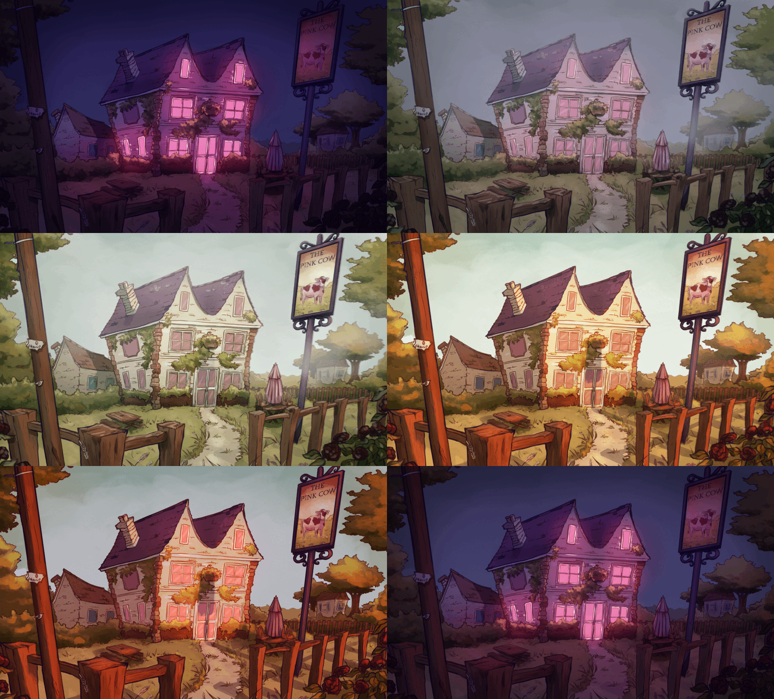

the pink cow, mia ikumi tribute 2022
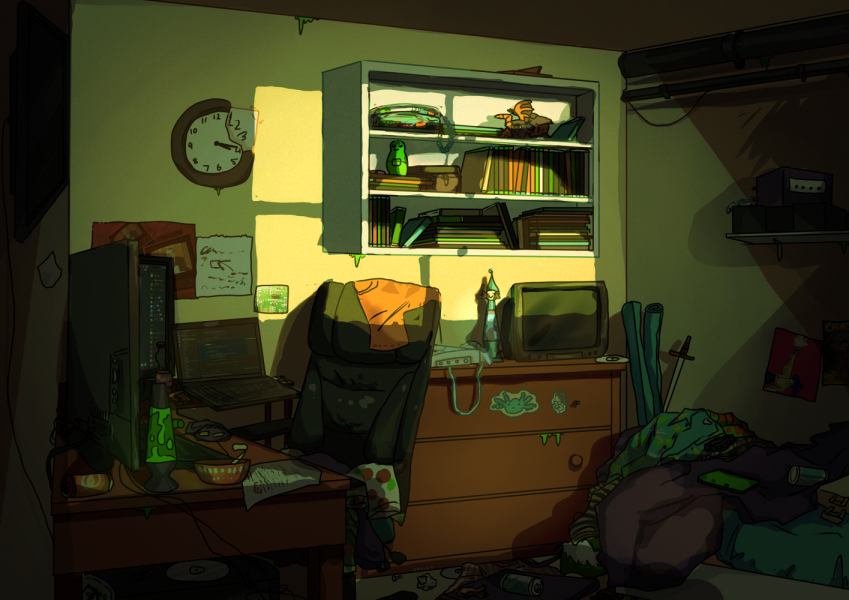
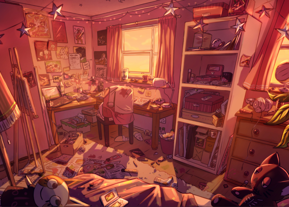
maxine's room 2020, iona's room 2022
in this blog i want to walk through how i drew two quite different backgrounds and how their purposes led me to different approaches.
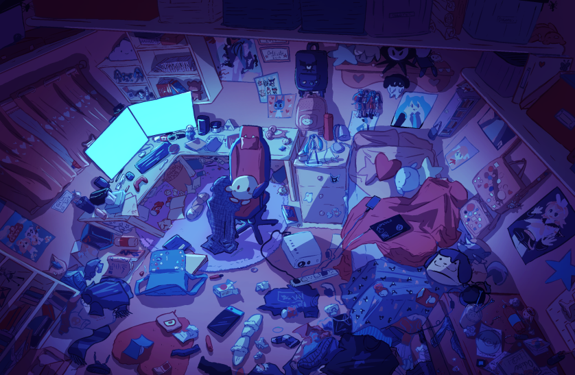
dolly's room 2024
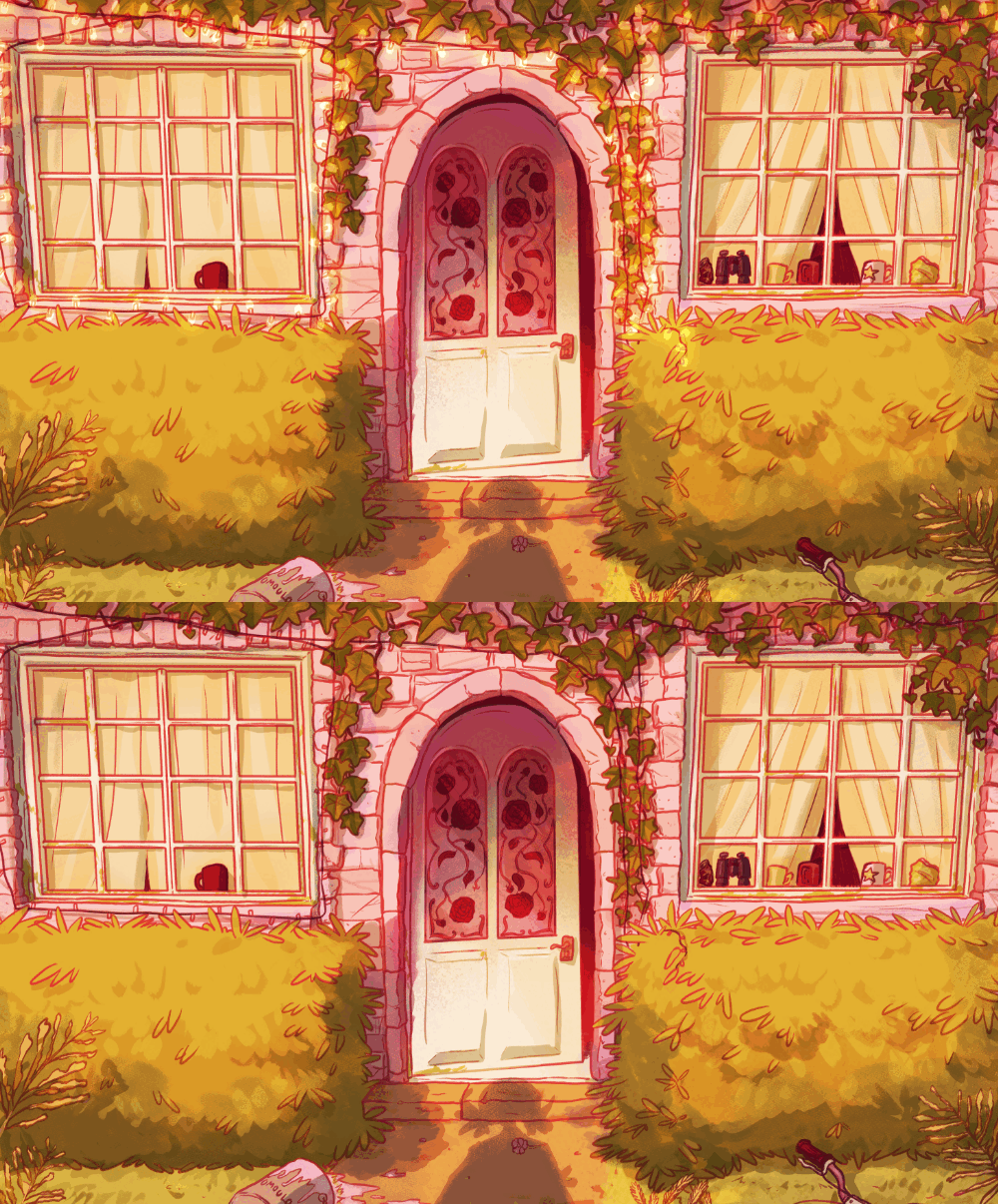
open house 2022
the first, a recent stand-alone illustration depicting the space of a young, dysfunctional teenager who spends a lot of time alone (referred to as BG1). the second, which i did a couple years ago which was the final part of a series of mock visual novel style backgrounds (referred to as BG2). this is LONG AS FUCK and filled with references so enjoy. im not an expert and im FAR from being 'professional' or like. even good lol but i feel i have enough wisdom that could help out all kinds of artists out there
steps to drawing a background
concept and research
for both, i will start brainstorming the illustration in a ref sheet - this will contain almost anything that will assist in the successful completion of the drawing. from literal copy and paste text of character bios to their actual visual references, to photos of objects, other environment or illustrations which are similar to what i want to depict, even maybe drawing some quick thumbnails if i have visual ideas of what i want floating around in my head, or potential colour/lighting schemes. ill usually digitally compile all of this into the same image file.
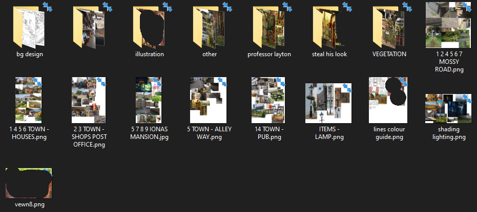
example of all these freaking ref files, the ref file for BG1, the ref folder for BG2
disclaimer, ive blurred a lot of whats in this ref file as there are images i wasnt allowed to disclose/images ive got off pinterest or search engines i dont have the source for
these ref sheets are something that get continuously added to throughout the process of the drawing as more details will emerge and become clear - its unlikely at this stage you would come up with every single detail before sketching begins. for BG2, i used various photos from my own personal store of reference images as well as others i had sought out elsewhere.
in the beginning of BG1, the ref sheet only really contained a brief overview of dolly's character and interests. i had drawn this character's room a couple times before as backgrounds in illustrations for another project, so i put these into the ref sheet along with the original sketches and notes. because i already had a decent frame of reference here, i went on search engines and through my own ref folders to find things to add to this ref sheet.
for BG1, i did a couple sketches which helped to map out the basic features of dolly's room - the bed, chair, door, window, etc.
i then also plotted a couple different angles on paper, as i thought quite early on i wanted to have an overall view of dolly's room, and to also have an uneasy feel about it. to do this i would need to attempt a dramatic angle which i decided to quickly sketch and plot where things would go to ensure what i was envisioning was something that could be executed.
for BG2, i was creating an entire village in a specific strange circumstance. it is an old, fictional english village which has become overrun with vegetation (as the character you 'play' as, jack, believes she is the only person left on the planet) so there is no one to maintain it. so i created a lot of reference folders and such that would be used across all eight backgrounds, but also specific ref sheets for each background depending on what was being depicted specifically (ie buildings). the obvious heavy influence on this project was the background work across the professor layton series for the nintendo DS and 3DS, which is set in england and is known for its charming depiction of the country. many of these folders also contain personal photos i took of local areas and overgrown vegetation, being someone who lives in england and has access to these sorts of areas. for any gaps in my knowledge, such as drawing fancy streetlamps, this is where i gathered images from the internet.
thumbnailing
straight after this we go into thumbnailing. usually i have a pretty solid idea of how i want the background to look so i dont need to go into various thumbnails, but i did this time with BG1. this is the stage to play with composition and perspective. nailing these two things down now is key to understanding what youre trying to draw and avoid having to redo things further down the line.
perspective crash course
perspective in particular is extremely key in achieving any kind of realism in the image, no matter how cartoony the style may be. it is used to make sure all objects and living things are scaled correctly with each other, and in this context is also used to create certain moods. there are times where the rules of perspective are broken or even just thrown out the window completely, but this is usually done for a very specific purpose and its obvious when someone does it intentionally vs when someone does it because they lack knowledge of the skill.
heres a CRASH COURSE. there is one point, two point, and three point perspectives which i will be respectively referring to from this point forward as 1ppt, 2ppt, and 3ppt. the 'point' in all three cases refers to where things the eye can see will vanish, or the 'vanishing point'. this vanishing point rests on the 'eye level' line.
above is a simple drawing using 1ppt. here you can see how the eye line and vanishing point dictate how large each tree will be to give the drawing the correct feeling of depth. things closer to the vanishing point are going to appear a lot smaller.
most drawing programs have tools that allow you to create perspective guides. i use clip studio paint (csp) which has these available to use. for traditional drawings i have to come up with my own ruler, which i do by attaching string to a drawing pin and faintly drawing the lines onto the page as a guide. this is much easier to do when youve kind of already got a grasp on perspective, so it might be easier to try it digitally first. here is an example of what my traditional perspective ruler looks like...
1ppt is great for directly trying to direct the viewer's eye towards something, and it is often used in film in a dramatic way to establish a scene, especially in symmetrical or grandiose locations, often outside or in large indoor areas.
2001 a space odyssey, 1968
phoenix wright: ace attorney, 2001
you will notice in these examples how the lines of the space all lead towards the vanishing point. however, such as in the 2nd example, things on the back wall simply follow horizontal lines because they are facing the viewer. this might change in a 2ppt or 3ppt situation.
but it can also be used in less dramatic contexts, more simply, such as here.
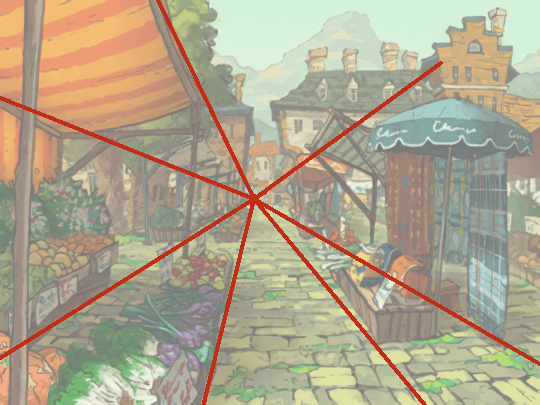
professor layton and the spectre's call, 2009
2ppt is probably the most common perspective used as it is more versatile and is easy to use to open up a space. on long layouts like in animation that scroll, youre essentially making two 1ppt drawings which converge in the middle. but also quite neutral and is used well in instances where dramatic perspective isnt necessary.
breaking bad, 2008 - 2013
treasure planet, 2002
3ppt is used to create more dramatic angles, often used in cityscapes and large areas or to create a sense of looking upon, down, or over something. how far apart or close together the three vanishing points are from each other with alter how dramatic the overall composition looks. its good for making a scene in a regular place suddenly fill with suspense especially in film and animation.
my own work, 2022
now these examples seem quite rigid, but you can play with perspective in all sorts of ways to achieve certain effects. when you know them well enough, these rules can be bent and broken.
for example, in BG2 you might assume that a 1ppt ruler was used, but in fact i used a 2ppt ruler to ever so slightly angle the building down so that the focus is on the door, and more abstractly this is the view from jack's eyes so she is on a slight hill looking down at the door as she watches her cat, rhubarb, enter the building.
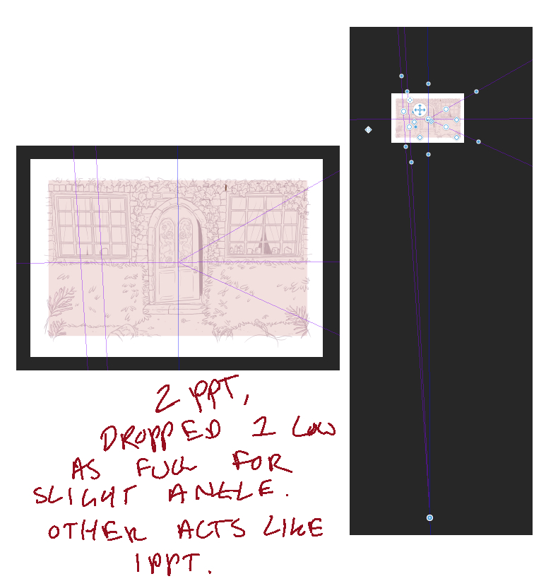
i rotated the eye line to be vertical so i could pull one vanishing point to the centre, to create the 1ppt feel, and pull the other one very far down to create a subtle tilt. this is what i mean by bending the rules once you know them!
sometimes, perspective is not really obvious at all and doesnt need to be used in a dramatic way. here are a handful of backgrounds where a perspective isnt really obvious or used for great effect.
professor layton and the spectre's call, 2009
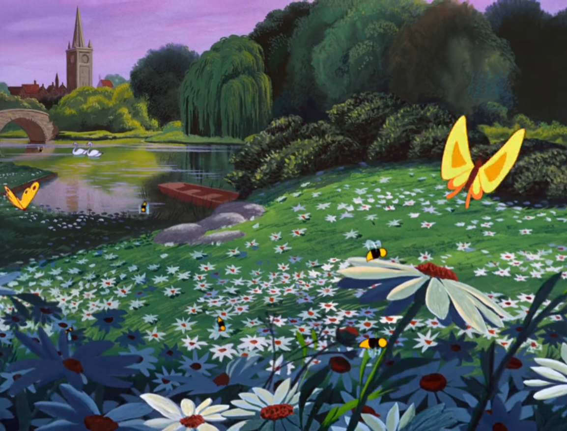
alice in wonderland, 1951
and sometimes, the rigid rules can be completely thrown out the window. i want to highlight the work of vewn.
the knowledge of perspective is what makes this drawing work. the style and proportions can more or less do whatever they like, so long as things get smaller the closer they get to the chosen vanishing point which is where the road disappears beneath the moon. the lines of the road, one way sign, hills, and even the direction of the girls legs and hair point towards the vanishing point revealing the scene of the pursuit.
perspective takes a lot of practice and it is something you build a sort of muscle memory with over time, so you wont always have to rely so much on rulers. jumping straight into using it can be quite tricky, so by intentionally looking for perspective in studying comics, film, art you like, and actual photos of real life you can train a perspective eye. when i first did proper studying of perspective i especially did this with real photos, first drawing on top where i thought the perspective lines could be. i then moved onto directly studying the photos and i would start to notice patterns that led me to think about the perspective.
composition
having a good sense of perspective will really help add to the overall composition of the drawing. the composition simply means the arrangement of things in the image, and how they might be used again to emphasise something. here are a couple examples of this in animation, where the composition is very 'active'.
neon genesis evangelion, 1995
in this background, we can identify at least two perspective points - the first vanishing point would be very high up as the buildings are tilted slightly towards the centre of the image. this puts the viewer on the ground - as if they are really there - looking up at the sky. compared to the skyline background below, these buildings are composed so that they leave a gap in the skyline, and the perspective makes the lines of the building point towards where rammiel is, the giant object in the middle. the angle makes it foreboding, as is being established in the anime that rammiel indeed a threat. the angle also establishes its enourmous size.
for more in-depth about this i wanted to link a few things. we can study a lot of cinematography and photography to get ideas of how to use everyday occurrences to our advantage in storytelling.
first, this excellent and extremely detailed blog about how composition was used in the incredibles, 2004.
here, the 'camera' is cleverly positioned so that the lines of the car windows all converge behind his head, pointing the eye to focus on him. if you read flooby's blog post youll notice this is used a lot throughout the film, as in animation most scene only last a few seconds so these tricks need to be employed to instantly force focus to a particular point. as we will explore later, this is not the only way to create instant focus - it can be done with lines, colour, and lighting too.
these videos (and whole channel) gives more examples for composition used in various tv/film, and demonstrates a lot of other compositional ideas which can be brought into more illustrative backgrounds such as the golden ratio, rule of thirds, and symmetry.
a note on foregrounds
foregrounds are something added to the front of the drawing to help add depth and is another opportunity to frame the drawing and add an extra detail. in the BG2 project, most of these backgrounds had things in the foreground as seen here which help to frame the focus of the image (in both cases, the buildings). these things arent major to the composition and could even be removed, but in this case are used to frame the image. with colouring later on, they are often coloured darker and so further point the eye to the focal point.
back to the drawing
so lets see how i took this into consideration for the thumbnails for BG1 and BG2. for BG1, i took a photo of my sketch and put it into csp and tried to recreate the perspective i had come up with. in the end, i used a 2ppt ruler which i flipped around by 90degrees. as you can see i just very briefly blocked in where the main pieces of furniture would go. i also have done this on a large canvas, so that i have plenty of room to play with the overall composition.
for this room, i chose an angle that looks down on the room for numerous reasons. firstly, as this is sort of an introductory piece to the character, this gives the best view of the room and especially the mess that will be present in the room, as this will be best seen on the surfaces. if i had done a downward angle, the mess of the table wouldnt really be visible for example. it also makes the room look slightly bigger than it is. it isnt specifically fish eye but it gives this effect. i also wanted these shelves at the top of the room to be visible full of tubs of the character's old belongings, which i hope signal to the attentive viewer that this person is someone who has kept their entire life's worth of stuff.
i added another layer just to refine things slightly, playing with the vanishing points and moving things together a little more. i then added this coloured rectangle which acts as reference for the actual canvas size of the image, meaning anything outside the box would get cropped away. this is a good way to contemplate if perhaps the sketch so far is too big, or you want a little more space, or you need to adjust the size the canvas will be to get the image you want. just to confirm how it looks, i sometimes block out this area in advance before cropping the canvas to see how it looks. i did this with the pink layer.
for BG2, i had drawn a rough overall composition on paper and again brought it into csp to refine the perspective and position of everything.
sketching and detail
now that we are satisfied with an overall composition, its time to create a proper sketch. for me, i spend a long time on this because it will lessen difficulty and frustration in the lineart stage.
technical aspects of drawing detail
i take care to properly sketch complex things such as furniture or the door/windows, continuing to reference the perspective rulers as i feel getting these wrong will impact the realism of the scene.
i usually sketch in the key architecture and structure of the composition, this being the walls or pavements, and then move onto key items like furniture or doors.
i learnt from javidraw's class (which seems to have been removed) this tip on drawing objects in perspective. you can use the perspective rulers to create grids - csp can generate one, or you draw it in yourself - and you can use this to guide how to draw more complex objects and even people in that perspective.
and for very complex objects, such as the ornate detailing on the bed frame below, you can sketch this flatly on a layer and then move the layer into perspective - so when it comes to lineart, it is easier to draw all that detail in the perspective.
during this stage i heavily rely on references. i will often be looking things up and using them to sketch things i dont have enough of a visual memory in my head to draw. if i know i will need to revisit this in the lineart/colouring i will add it to the ref sheet.
in terms of using references, a realllyyy great tip i learnt from cysketch is to use multiple references of the same object to create a unique version instead of just copying one reference. this helps you to create something more original in the work, and also helps build up the knowledge of that object in the visual bank in ur brain, in whats the common features, how it works, what seem to be the areas that get variations, etc.
for instance in the BG2 project, i used lots of photos i took while going for walks around various towns. i took a photo of a village community notice board, and when i got home looked up more examples. i got to learn the sorts of structure of it as well as various ways theyre decorated, and created my own version adding other detail like rusting and a more curly decoration at the top.
i used this sort of method for the whole project, creating large reference images of all different types of buildings, architecture, brickwork, vegetation etc as well as the style of pointy buildings found in professor layton background design, and mishmashing them in different ways to create the old english village look that i wanted while not directly copying something that already exists.
something to consider while drawing backgrounds is how 'lived in', or messy, the space is. for both BG1 and BG2 'lived in' was certainly the impression i wanted to give. i pay attention to small details such as having books at different heights or perhaps some leaning over, asymmetrical vegetation growth and positioning of posters etc, cables that arent perfectly straight. of course, if this was the intention then i would have all the books perfectly lined up or the ivy over the pub symmetrical if i wanted these spaces to feel tidy and immaculate but in these cases i do not.
deciding on details
this is probably my favourite part of drawing backgrounds or illustration in general and you can take this into all areas of artwork including character design etc. BG1 is very detailed and is more self indulgent in its level of detail, whereas BG2 has a lot less going on but everything is there for a reason too.
so this is going to be annoying af but i remember back in like 2012 seeing this post about a piece of homestuck fanart before id even read it which told a whole story without knowing anything about the characters. attached to this post was a short appraisal - while my art teacher was chastising anyone in the class for being interested in alternative art like comics and thus creating insane inferiority complexes, tumblr user renaris wrote a short analysis of this piece that changed my brain chemistry and the way i thought about making art forever.
the original artwork is still up here, but the analysis can only be to read found through other old reblogs. here is a link that allows you to see it
i also learnt about this more in my film studies class a few years later, where we had to analyse every single frame of scenes from films and why everything - camera angle, lighting, sound, and anything else that can be considered part of the mise-en-scene - should be considered and its inclusion can tell the story. even if something has not been considered, it will be taken into the context around it and be given an inferred story by the viewer. so anything i add to my drawings i hope can find meaning, whether its the meaning i intended or not.
the meaning doesnt have to be deep and in fact are just to give the viewer enough information to make an immediate almost unconscious conclusion about the scene. if the scene was in an office, its going to be decorated with objects typical to that situation. in this example, we see the headmistress' office in a school. its as we would expect - clean and organised as its important to maintain this image as the head of a school especially for the numerous outside guests, and filled with things like stationary, office furniture, and her personal belongings on a chair. it conveys the characters job and how seriously she takes it, and so reflects how she wants the school to be too. her character is represnted as welcoming and nuturing also, which would be shown by the plants around the room.
Waterloo road, 2006 - present most random slop example ever but it was the only thing i could think of off the top of my head lol
however, in a later scene, her office has been ransacked. this is not established by a character saying anything, or by the audience witnessing the attack happening - its established by this shot of her usually neat office completely torn apart. the drawers are left open, her plant and random objects are toppled over, and papers strewn across the furniture and floors. we can infer just from this shot that someone was looking for something, and we can tell they were quite desperate as they left no stone unturned to find it. in both cases not only are actions shown, but the perpertrator's state of mind and motivations too.
this couldve been taken a step further - the door couldve been damaged, all the furniture moved as though they were looking underneath everything, or the papers and photo on the wall ripped off.
sometimes, the absence of objects can do some storytelling based on contextual cues too.
in the flesh, 2013 - 2014
theres something to be said about fridge scenes and how often theyre used and what they can convey... for context, this is a show about reanimated zombies who dont need to eat what they wouldve eaten when they were alive - in fact, it makes them sick. so this character is looking for food and is not finding it because the house is occupied by the undead. a character is clean who cares about their diet might have a fridge full of whole foods and vegetables that are neatly arranged into tupperwares. for contrast, a character who is messy and doesnt care about their diet might have a fridge full of poorly wrapped junk foods, expired foods, and maybe some spills.
for BG1, i really wanted to convey a lot about the dolly who is the owner of this room. i decided to have a lot of surface level detail to those who would just glance the image and get the sense that dolly is a chronically online, kinda messy fan of popular (in 2022) media who spends a lot of time in the room.
but i hope someone who looks for a bit longer, and who might one day read the story dollys character is in, would notice more things that give an insight into dollys life. one of the obvious things is how dolly REALLY likes and is heavily invested in lots of popular online things, not only video games and shows but is deeply into online fandom culture and has figurines and ita bags, and a dedicated setup. but it seems dolly neglects actual life, as seen by the state of the room. a messy room like this can indicate lots of things - lack of time? depression? struggling because of neurodivergance? the mess has clearly been there for a while as there is a lot of tissues, food/drink wrappers, and the huge pile of clothes. most of the clutter clearly gets pushed under things, or down the side of the bed, or to the sides of the room so dolly can wheel the computer chair, or get into the bed, or walk to and from the bed/desk/door (the door is not seen, but suggested to be off scene to the south.)
further details probably no one would notice but ill explain here. dolly still has everything they own, as the shelves near the ceiling are full of tubs and folders. i hoped by varying the different kinds of tubs instead of just drawing the exact same ones would show this is a collection that has built up over time. why is all this stuff here? did dolly choose to keep it, or is it due to the parents? what does that say about them, someone cant let go of anything? why? etc etc.
a detail only to be spotted if zoomed in is that dolly gets shit marks on school work, but old certificates dated in the 2010s (when dolly wouldve been younger) show achievement. so, what changed? a detail like this hopefully begins to tie into dollys apparent chronically onlineness, and the mess, and maybe signals more towards depression and a disinterest in real life.
now it may be that you look at this and think that it looks like a collection of nonsensical scribbles but to me i understand what im looking at as a lot of the stuff here ive drawn many times and will find it easy to translate into lineart. however, for backgrounds or objects where i feel less confident going into lineart i will take much more time detailing the sketch. the idea really is to get as much pain out of the way in the sketch phase before the lineart phase as i mentioned previously.
i did this for the first cityscape drawing i ever did and hopefully the last lmfao as it was so new to me.
in BG2, there is far less detail but what is there is still very intentional. i made this project in 2022 which essentially is a giant spoiler for the ending of the project i did in 2023 (and for those who give a fuck actual comic is coming in 2025 , was meant to come this yr, but i caught major depression instead :( kyaaa). jack has come to this village to find the other last person on earth. the house in particular is indicating various things about this person, some of which are surface level, some of which link directly to other things seen previously in the storytelling, and again some of which would become clear in future storytelling.
the overgrown vegetation, blinking fairy lights all over the house which seems out of the ordinary but jack understands this is the person in the house's way of showing theyre inside in a world that seemingly doesnt have electricity, and clearly this person in the house has spent a lot of time in the house looking out the window. but theres conflicting things happening - its clear the person in the house has spent time outside, so why is she seemingly spending time in the windows peering out when she could just...go outside??
the other detail here is the stained glass windows. a lot of older houses in the UK have these stained glass windows with flowers on doors so i wanted to do something similar. they also nod to the house owner's own interests.
in BG2, i used various objects to direct the attention to the doorway as this is the main focus. i also used colour to do this, but more on that later. the paint bucket on the floor, and the bicycle handle, both point towards the door so even if the viewer would look around the whole drawing, their eyes would get led back up to the door/ top of the house.
lineart
at this stage, style differences are going to change how the drawing is approached. not every piece will use a separate lineart - for BG1, i used the sketch layer and erased/refined parts to make the lineart. for BG2, i created a whole separate layer to do the lineart on. but in the drawing below, i painted it and so did not use any lineart at all, instead using light, shadow, and tone to help separate and define objects from each other. this is completely a stylistic choice.
dynamic lineart
unless its important to the style i try to avoid having too many lines that use a ruler and vary them slightly, sometimes foregoing a ruler altogether or erasing bits here and there to add some visual interest and not create something that is to rigid and clinical. again this is all up to personal style and you can just ignore what i just said pretty much. i sometimes keep furniture rigid as it allows me to be more messy with the things on top which are usually the main focus such as in BG1.
in BG2, i used subtle line weight variation. lines i use to detail shadows or things that the colouring will actually do some heavy lifting on, such as the creases on the curtains, the cracks and edges in the bricks, and the veins in the ivy i applied much less pressure. the detail is important, but using the same pressure as everything else would potentially create too much visual stimulation and become too cluttered and uneasy to look at. the lines are here to define things and separate things from each other.
i used a soft, oil paint style brush which actually has a very slight translucency to it. these drawings are intended to look somewhat traditional again pulling from the professor layton style but also has a link to the sort of meta of the universe its set in.
in BG1, as mentioned i copied and pasted the lineart and went back using an eraser and a brush to refine the whole thing. i used a pixel brush named 'turnip pen' in CSP and disclaimer ive had csp for 5 years and i just fuck around with settings a roll with it so i have no idea if that is what the default brush is but if you want it (and the BG2 one) hmu. this brush is used to deepen dolly's connection to the digital world.
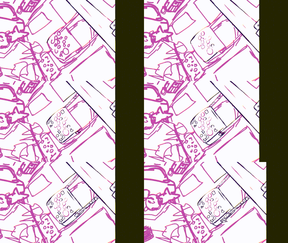
something you can see in BG2 is that i had also pre-coloured a couple areas with the lineart brush. these areas i knew would be the darkest areas of the drawing, so i just did it. in other illustrations, i have used this more liberally to block in shadows or dark objects such as below which isnt the best example as its a bit old but originally it was going to have a very limited colour scheme (it ended up just being a couple colours) so i thought i should just get the darkest colours out the way. in this drawing i used the general thick brush in csp as it was a gorillaz fanart and i wanted to emulate hewlett's the early 2000s style of thick lineart, as well as comics in general do this a lot.
detail in the lineart
to follow on from the previous section, i want to talk about using lineart to gesture small details. in the colouring section i will explore this even further, as sometimes there are details that are so faint they dont need to be gestured with lineart. ill hotlink it here* if after reading you to want to jump to it.
i talked about varying line width. this is important to do especially when it comes to using lines to define what is important in the image, knowing what to do to gesture something, and especially if the background depicts a large space. you need to vary not only the density of the lineart, but also the time spent on certain details.
for example, with brickwork you do not need to draw every single brick. for BG2, i did this because we are so close up to the house and the bricks are large enough - but for the bushes directly in front, i only drew in a few leaves. i drew more in a line down the side to give it dimension, and a few more here and there to signal how its overgrown and that it is also not just a flat surface. the detail put in by colouring later on also helped give it dimension.
in other BG2 backgrounds, on the buildings closer to the foreground i paid more attention to the bricks. but as the buildings get further away, i did not draw any at all because it would create too much visual confusion and take away from the actual focuses of the illustration. a few gestures of bricks at the front is enough to get across that the buildings are old, you could guess that therefore all buildings in the area are like this. this also goes for the vegetation, adding proper dimension to doors and windows etc.
also here, look at the brick steps leading up to the two buildings on the right. i havent always drawn rigid straight lines to show their cuboid shape, i let these lines be more patchy. this is also a good opportunity to convey something about the texture of the brick too. as the brickwork is quite old, i added cracks and the lines are wobbly to show wear overtime. if this was a brand new neighbourhood, or one highly maintained, i wouldve made these lines a lot more rigid and straight.
invader zim, 2001
in this layout, dad membrane's lab has a lot of cables and buttons, but notice that the artist hasnt drawn every single button as 3D as it would be in real life and more grooves in the pipes everywhere. it would simply be too much detail, and create too much visual mess. a simple table looking grid is enough to communicate that it is a pad of buttons to the audience. even in a context where this bg is not in a cartoon where its only seen briefly and not the main focus, it would still be enough to communicate what it is.
and in this background, the grass is only conveyed by the occasional little patch drawn in. where the grass meets the walls and pavement however, more attention to detail is added to show it has some length to it. we can infer that it is grass as well based on context - its a green area in front of a house with a path in-between, its certainly going to be grass.
in the interest of conveying details in lineart, this is where we can refine the ideas that mightve come up during sketching. i want to spotlight some of steve lowtwait's work. he had a lot of really insightful tutorials on twitter and is an actual professional layout artist for big city greens so i really really recommend reading through some of his threads!
in this layout, you can see lowtwait has done what i described here about not needing to draw every single brick - and you can see as the building gets further away, this gets gestured by simple lines.
the area is quite rundown so he has used lineart to make objects look imperfect . for the bins, he has not used any ruler at all and freehanded them, letting them appear somewhat beat up as if theyve been used and bumped around for a very long time some. a couple still have their lids, one is full with the lid askew, two are missing their lids and have random objects sticking out of them which give visual variety and interest to this repetitive object and add more opportunity for storytelling. the poster has also clearly been there for a while, as there are nicks in it which indicate the poster is ripped. on the window ledge to the left, there are also little nicks in the architecture which again would indicate the building is older and perhaps for some reason no one cares to maintain it or get it fixed.
these details may seem obvious, but its paying attention to these details while drawing that are the reason someone can merely glance at the image, as would be the case in cartoons where this probably wouldve only been seen for a few seconds, and understand that it is a rundown alley straight away. theres other little details here such as the odd slightly bent bar on the fire escape, the rip in the cardboard box, the bottle of bear on top of the piano that add to this feeling of the dodgy dumpster alleyway.
in BG2, i wanted to convey that the vegetation is overgrown and not being maintained despite the house being occupied, and that the building is very old. for the former, if this was a house where the vegetation was maintained then the leaves i had drawn on the bush wouldve been far more linear and uniform. because theyre overgrown, i have them sticking out at numerous angles and being out of control. for the latter, i drew the bricks freehand so they look as though they have naturally eroded over the years. ive also shown this by adding a few cracks, chips, and marks of general wear.
in BG1, i drew some video games on dolly's shelf.
they are so distant and small in the drawing that i simply had them be mostly apart of the same rectangle. this follows the same logic as what i said before about bricks - it would be too much visually to try and define each individual game case so i just did it very loosely. i knew they would probably be all coloured the same so i did a little more line definition than i usually might.
further avoiding visual confusion in lineart
a final tip is to look out for how the lines are interacting in the lineart especially when it comes to significant elements of the piece. this is quite hard to find examples of as it is something most professionals know to correct, and its also quite difficult to explain as its more of a gut feeling while looking at the work, but luckily something happened while drawing BG1.
it might not be obvious but i noticed that in the tshirt, the plug socket that is lying underneath looks like it is somehow connected to the shoulder of the tshirt. this to me creates a sort of confusion of how the objects are interacting with each other, and even though it should be obvious the cable isnt connected to the tshirt, one might think that maybe it is?
to remedy this i simply moved around the whole cable from under the shirt to make it flow a little better and make it more obvious its the same cable.
in general, i always follow this rule which comes more or less automatically - if two differentiated objects are interacting, and one is next to or under or in front of another, the two edges should not be directly next to each other in a way that could confuse the viewer into thinking the objects are apart of each other. i red-lined a few more examples of this happening in the same area.
a good example of this is in this layton background. looking at it, you can see how the buildings all actually stand out from each other and dont muddle with each other. this is of course helped by the colouring, but lineart is generally the stage to try and spot any problems as there is not colour to help distract from potential issues.
here is the final lineart for BG1. the pink is left from the original sketch and merely erased, the purple is where i will have redrawn or drawn over areas.
i will revisit these linearts to go over colouring the lineart soon, but at this stage i usually leave them black/a dark colour.
another quick link to colour detail here as it flows if u want here*
colour and light
drafting
so when i get to this stage i do a draft of colours and select the potential colour scheme. sometimes i plan this as early as the sketch stage, but doing this now is very key.
for BG1, i had a good idea of what i wanted to achieve. carrying on the importance of showing that dolly is very much online, i wanted the computer monitors to illuminate the entire room. i was reminded of a few instances where similar sort of characters exist in a similar setting.
pokemon scarlet and violet, 2022
serial experiments lain, 1998
paprika, 2006
howels moving castle, 2004
for the paprika and howls moving castle backgrounds, imagine them without any lighting, and just left with their lineart and/or flat colours. like the BG1 lineart above, it would be quite chaotic to look at, as there is so much going on its difficult to know where to look. by adding lighting, it guides the eye to certain areas while still letting the room be busy. the shadows in the foreground create almost a frame so the eye is directed towards the lighter areas of the room, where the focal point (the characters) are. the other two backgrounds also do the exact same thing.
id actually used this sort of lighting in two similar drawings from a few years ago so theyre not the best but i feel the colour has a very similar effect
with this in mind, i backtracked slightly and made some decisions about the flat colours. i knew that with this dramatic lighting what i chose to do with the flats might not matter so much as the lighting will be doing most of the heavy lifting. however, if this room was being illuminated by natural light or an overhead light, for example, i would perhaps aim for slightly more realism in the colours.
here i chose to go with a colour scheme using pinks, purples, and blues. purple and blue are key colours for dolly. for 'online' i think of vivid blues and greens, and the greens had sort of already been filled by another one of my characters so i gave dolly the blues and purples instead. pink is also an extremely significant colour in the work that dollys bedroom was originally featured in, and in this case i decided to use it again as i could use deep pinks to highlight other areas in the room for the eye to be drawn to. later i will go over how i use an unnatural palette like this to colour all the different objects in the room.
i picked the palette and kept it on a layer above everything, and very very loosely coloured the room before testing the lighting on top. this is the time to go crazy and experiment with all sorts of colours and lighting. the colour scheme did change slightly, and as you will see below i tried a warmer and cooler palette of lighting.
similar to the references above, i wanted the light to illuminate most of dollys mess. i wanted the eye to be drawn to the living space (ie desk, bed, floor) first, as this gives the best indication of dollys daily life. then, the eye can move around and notice the rest of the room.
before settling on the plan for the lighting, i wanted to look at the overall chiaroscuro of the image to make sure my lighting was actually going to work as intended. colours can sometimes trick the eye and make you think there is a good contrast going on when in fact it could be too strong or too weak and not differentiate areas as well as you think.
i believe i learnt this trick from jaykittens bg q&a which is another huge document on how to draw backgrounds and they are far more talented at it then i am! please check it out!
in csp, i make a new layer above everything and fill it pitch black. i then set it to 'colour', or csp also lets you use 'hue'. this greyscales the image and allows you to truly see whether the contract you had hoped for worked. then, to go back and adjust the layers and keep double checking you can simply hide/reveal the layer instead of having to faff about trying to keep greyscaling the image.
generally, you want the focal point to be the medium tone. the lightest tone is in the very back of the image, and if theres any foreground it is darker than the middle. this helps to make the middle ground the focal point. the light background would generally just be the sky, which (unless needed) wouldnt be horribly detailed so it doesnt distract from the focal point. it also helps to frame the focal point in the same way that a darker foreground does.
ill explain how i made this work for the project of BG2.
in most cases, the focal point will be a medium tone which is framed by light or dark tones. for 1, 2, 4, 6, and 7, the sky is a light tone that works with the foreground done in a dark tone, to frame the medium tones which create the focal point of the scenes in the village. in 2, shadows are cast more on unimportant buildings so that the smashed in window of the littlebury stop will become the focal point.
in 1 and 6 there is less of a focal point to be made, so the lighting is far more generalised. but for visual interest, there is still contrast and things happening in the foreground.
in 8, or BG2, the lighting is coming head on from behind the 'camera', but this time the colours are doing a lot of work. the pinks and greens contrast each other. the lightest area of the drawing is the door, while the darkest areas are also the door making it a high contrast part which the eye will be drawn too as this is the focus. the eye is also drawn to jack's shadow on the ground which is a big contrast too. i made the mug and binoculars in the window dark and alarming warm pink/red colours so they are sure to make the viewers eye flicker to them, as theyre important to notice and keep in the subconscious going forward with the story. the greenery is a cooler colour and so is muted against the pink things going on which are the main focus.
but like all rules, these can be manipulated and broken. in 5, the light area is at the bottom, and the dark encircles the middle tone. this background was actually a gif with flashing lights, which would draw the eye, and it also contained the brightest colours of greens and yellows as well as a bright pink that doesnt happen anywhere else in that particular background. so it was more the colours and animation doing the work here. in 3, there is a very dramatic contrast, the light commands the eye to focus on the cracked window and jacks shadow.
one of my favourite uses of contrast is from serial experiments lain, in scenes where lain is walking around.
these backgrounds present a high contrast neighbourhood, where bushes and buildings are only distinguished through very light colours schemes and are invaded by these almost black shadows filled with strange spots and splotches - red purples and blues in the ones below. without knowing anything about lain, it gives you the sense that in a mundane scene like a neighbourhood, there is something unsettling going on here. shadows are sometimes used to signify a dark atmosphere of a person or society, or suspicion, but here this is turned up to an eleven. having seen (like 6 eps) of the anime for me these completely unnatural splotches are representative of the unnatural world that is explored that being the wired, and its plain symbolism that it is a critique of these worlds as it is casting a shadow the current society.
colour palettes
for some very basic theory on colour, please read this post. i think its very important to consider colour harmonies while choosing a palette and understanding what certain colours are going to do to the focal points and mood of your drawing, and also how the colours will interact with each other, even when going for a very 'realistic' colour scheme. sometimes, just going for strictly 'realistic' colours is fine because the lighting will do most of the heavy lifting, but i usually like to work with restricted or slightly abstract schemes to achieve more fantastical, surreal, or dramatic effect.
colour scheme is something to think about in conjunction with the things you want to draw attention to in an image. for this huge project i did, i forced a lot of red and pink into colour schemes as it is an important colour thematically, and coincidently is one of the more alarming colours to use so it was used to highlight things.
unusual colour palettes
these old tumblr/twitter colour palette challenges from like ten years ago are an excellent way to experiment with conveying and understanding colour. i specifically remember this one as i used it to draw more ace attorney characters but it was secretly a huge part of how i managed to improve my colour usage and its one of the things i get the most compliments on in my work.
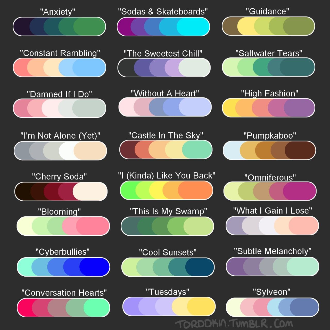
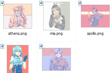
palettes by torrdkin, having to link through another blog though
in BG1, the colour scheme completely omits the following areas of the colour wheel.
which means i need to think about the palette more and what colours i should use to try and mimic the closest one to the actual colour.
theres a poster on dollys wall of kagamine rin.
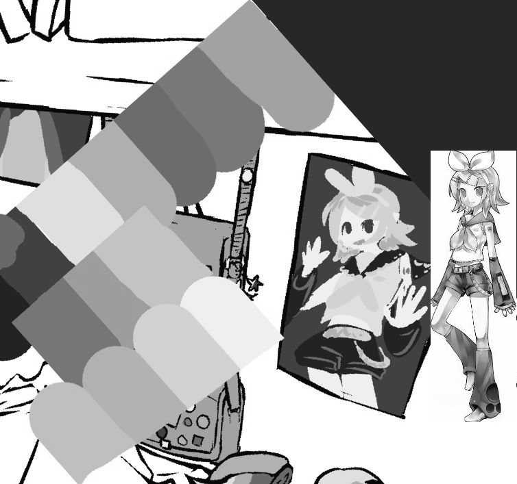
rin has a colour palette which doesnt really match up with this drawing. but my mission here to to make the viewer able to recognise that it is her, even if the colours arent 100% accurate. i used the tone closest to her skin tone for the skin, but there wasnt any yellow at all. so i chose the peachy tones for the yellow parts of her design, as these are the next colours closest in hue and tone to her design. vocaloids official design have them wearing grey shorts and leg/arm warmers but theyre commonly depicted as dark grey or black which is what i prefer, so i went for the dark purple. either way, its the darkest part of her design and so making it darker still makes it recognisable. the white of her headband and top were more difficult, as the colour closest to white was already used for her skin tone. i didnt want to make a whole new colour just for this tiny part of the drawing which would be mostly obscured in shadow anyway. i also prefer to use blue/purple toned whites for fabrics generally to help differentiate on people with paler skin. so i chose the next closest colour which is the purple. it does appear slightly darker than intended but again it still does the job of conveying the character more or less, and sticks to the colour scheme.
even in BG2, which is more realistic, the colour palette was far more diverse and realistic, but i still had to liberally use colour theories to signify a colour that wasnt in the image. for example, there are no blues in this range at all. but in using the colour closest to that (the turquoise/teal) when put against the reds of the little littlebury shop for example, tricks the eye into thinking it is actually a more royal blue than it is.
practising drawing in just black and white, in just just one colour can really help to understand how to use light and dark to differentiate certain things.
detail with colours
time to return to talk of detail....
we return to the comment in lineart about detail. for books that are up close, i would colour them slightly differently just to create a little visual interest but there arent differentiating colours all over the colour scheme that would actually distract the eye to the bookshelf. however, as they get further away, i will suggest different coloured bricks with a splash of another colour. in far away buildings where lines for bricks would not even be suggested, i do the same with colour and just do the whole thing the same colour. in BG2, the building is seen before but the colour is completely flat as it would be silly to try and differentiate the brick colours.
for BG2, i added a lot of texture to the flat colours before adding shading, such as slight shadows and patches on the ivy, or cracks and discolouration on the bricks. i even added some very light shadow work as my plan in all 8 backgrounds was to use the exact same layer/settings for the shadows and because the light is so strong here they didnt need to be as harsh. this depends on the style as this style is slightly more realistic than BG1, where i only chose to do this on patterns (ie posters and blanket, and a bit of shading on the walls. i c an show a couple other examples:
in this background, the floor is in a cafe which is cleaned regularly and so would have qiote reflective floorboards. i created a similar effect as to what would happen in real life where toyu can see a faint reflection of the white pillar.
in this other invader zim background, the school building is very run down and not maintained. damp is illustrated on the walls and doors using a faint colour. the lack of lineart gives it a subtle effect and signifies that the damp is a part of the wall and not on top of it. if it was thicker moisture like some kinda goo then lineart might be appropriate to help demonstrate its thickness. another example of where this would be one is the sky - i always treat it as a painting and never use lineart in the sky unless its to highlight something.

alice in wonderland, 1951
for example, in this alice in wonderland background, the flowers right at the front are heavily detailed. you can see texture and distinction between petals and the pollen. but as they go further back, they lose that definition but you still know theyre flowers. as as they get even further back, they eventually just become white specks but because of the whole context of all the white flowers we know the specks are flowers. even without the cue of the other flowers in the foreground, most people have the visual reference of seeing daisies on a field to be able to infer thats what it is. a similar thing happens here with the trees.
technicality of creating light and shadow
identify where the lighting source is coming from. in BG1, the lighting source is very direct and it is also artificial. because it is in the room the effects will also be a lot more harsh.
i use a 1ppt ruler to map out the directions the light will be hitting and this will also dictate to me where my shadows should also be facing. i simply bring the shadow down along the lines. using a reference of this kind of light in my own room and by treating a close source of light with a perspective ruler, you can see how the shadows actually follow the lines created.
in the second photo, the light source is seen. it is a phone camera which is angled slightly towards the wall – these areas will receive the dramatic shadow. but as this light is not a hard light pointing towards something (in the same way, say, a torch would), the light still is being dispersed around the entire room and so it is all getting light. the blue areas indicate the areas that arent directly receiving light, but are still illuminated as the light is bounced around the room.
based off of this, i introduce an airbrush to create a soft shadow that encases the entire room that creates the illusion of the lighting dispersing around the room.
i went back and added a blue tone (navy blue, 58% opacity, hard light filter). i did this as part of the lighting. the screens blue light would add a blue 'filter' to the room, similar to how the phone light in my own photos added a harsh white overall tone to the room.
finally, i added the lighting source. i mostly again used very light blue overlays on low opacities, and a layer of add (glow) using this light blue to put a harsh light in the places the screen light would directly hit and illuminate.
compared to in BG1 where the lighting is coming from inside the room, in BG2 the lighting is coming from the sun, specifically at the beginning of sunset. i have to visualise completely outside of the drawing. to help, you could draw this on paper/another layer for reference.
doing this helps me visualise how shadows will work in the illustration. the sun is lower down than say the middle of the day so the main shadow seen in the drawing is jacks shadow, who is standing a few metres away from the door so her shadow is about this long. things that are on the floor like the bucket and bike wont receive as much sun so their shadows wont be as long.
for BG2 project i used a teal colour on multiply - which is neutralised by the 36% overlay in brick red and the 69% light yellow overlay of the sun which make up the lighting of the sun. the colour of the shadows on the multiple layer is something i play around with often especially once the rest of the lighting has been put in place. different hues and tones will add to the contrast or mood of the shadows. in BG2, the shadows are in sunset and i didnt want them to contrast in a purple tone too much, i want the image to look quite soft so in the final drawing they fall into the overall warm colour scheme if you were to colour pick it at this stage. but this was only achieved by playing around with the colour of the multiply layer.
compared to BG1, the sun illuminates almost the entire drawing as theres not a need to 'highlight' specific areas, except perhaps anything that is shiny or reflective.
for both BG1 and BG2, i used a multiply layer to colour to create shadows in the whole drawing. in a much less detailed illustration of say just a character, i would be more likely to pick different colours for each shadow instead of multiply layer the whole thing. if you do do this method, you can soften the opacity of some areas of highlight or even change the colours slightly. i did this in the following backgrounds, as having the whole multiply layer be one colour or one opacity would be too harsh.
finalisation
and then at this point, i walk away from the drawing for the final time and try and come back to it after a day or so to see how i feel about the colours. looking t it from a distance again will help to quickly identify its flaws, and if the contrast of everything is leading your eye to the right places.
i adjusted BG1 a few times and actually went back and drew in some certificates and the computer tower which are pretty damn important but just slipped my mind LOL but overall i was happy with it. it was the first complete illustration ive done for months and months so its not perfect but im happy to have finished it and shared the process with you reading if you got this far...:)
the final thing that tied BG2 together is that it was a gif, with yellow fairy lights that blink on and off and has rhubarb the cat interact with it later on in the actual film it was used for. :)
final examples and links
so i wanted to talk more about some backgrounds that i couldnt really slot into one specific section as they hit lots of different notes to talk about so i will discuss them here.
first, id like to talk about the work of maurice noble, whose work would be best recognised from classic cartoons such as road runner. his backgrounds are known for having minimal colour palettes. these backgrounds command the same job as BG2 as they are in conjunction with a storyline and are interacted with by characters.
boyhood daze, 1957 and claws for alarm, 1954
heres a couple backgrounds that are very similar visually and with technique.
in both backgrounds, we are instantly drawn to the door thanks to numerous things happening. in both cases the window light is cast onto the door and the rest of the room is either in shadow or just not as bright. the doors are both also the lightest colours in the image that contrast with the shadows making them stand out even more.
in terms of detail, maurice is excellent at simplifying things and saying a lot with very little. in the first bedroom, we are going to look at it without any context, then revisit with the context.
the eye is immediately drawn to the white door. it is the brightest part of the image, it is in the very centre of the image, it is surrounded by bright yellow, and the reflection of the window leaves a huge 'X' over it as if to say, "here! x marks the spot, here is where you should look!". so its MORE than safe to assume something will happen with this door. around the room, are childish drawings of butterflies on the wall. the wallpaper also has a delicate flower pattern, and the colours are blue and yellow. its safe to assume its a child's bedroom. the geometric sculpture might throw one off here however, especially with its eye catching red, but this is simply a staple of noble's work.
with context, this background appears later into the seven minute film so we know this is a childs bedroom. here, the child ralph is imagining certain things based off of things in his room - and in this one, the sees his door and turns it into a prison cell in his mind. this is likely why the door is seen from this downward angle, to make the transition to prison door more intimidating.
we shall do the same with the second background. the eye is once again drawn to the door, which is the lightest area of the drawing. its surrounded by a simple pink wall and plain floorboards with a floral carpet. this on its own would convey just a normal average home, the door being the focus is inviting and the viewer will wonder what is beyond it. but it is framed and enveloped by crooked purple shadows, which is so dark it even cancels out the pattern of the carpet. as explored with the lain backgrounds, the contrast in how dark this shadow is makes it far more mysterious and even threatening, as though we have no idea what lies in it. following the purple, you see a broken bannister leg and a wonky wall lamp, which lead to nothing but pitch back, further fuelling the feeling of not knowing what could be lurking. it feels as though the door then, is the only safe haven for the viewer, as it is still enveloped in light which we would associate with goodness.
with the context, this is porky's room and he is just trying to sleep, while sylvester the cat hears that something is lurking in the house and is petrified. our thinking is correct, sylvester feels porky is the safe haven in the threat of the rest of the house. some action occurs with the door, so not only can it have symbolic meanings but the lighting is used intentionally to get the viewer to auto-focus on the door.
heres a few more backgrounds i love. with everything learnt in this document you can begin to take apart the way theyre constructed and what they are doing, even without the full context of the animations they originated from. what is fun about art is that sometimes you will come up with your own interpretations as to what something means or what is going on.
what's opera, doc?, 1957 and road runner (est 1950s)
now lets talk about some stand alone work. i want to look at the work of JMW turner, who was an artist. i was his work many years ago at an exhibition and i always remember in particular his paintings of the sea.
the burning of the houses of parliament, 1834
in this painting, colour is used to highlight and take the eyes on a journey. im drawn immediately to the bright yellows and oranges of the fire, warm tones that are reflected onto the sea where we see the back of people watching on as the parliament burns, making the viewer out to be one of the spectators there. to the right hand side, the bridge is illuminated and sort of contributes to this frame the eyes darted around from the fire to the people looking on.
study at milbank, 1797
in this piece, the overall tone is very dark, obviously set at night. but the sky is illuminated by the white moon which is where the eye is drawn to. being drawn to this area, i follow the reflection into the sea and look at the contrasting shore and boats as we are seeing the light source head on everything else is in complete shadow, only seeing the darkest part creating a contrast.
i want to compare this painting to a very similar one by claude monet.
impression, sunrise 1872
red is used here alongside greens and blues on the opposite side of the colour wheel. the eye is immediately drawn to the high saturation red, being led downwards towards the dark greens that depict the shadow of people in a boat.
other advice...
diversifying portfolio and experimentingif youre looking to go into industry or just want to expand your skills by doing something different, its worth trying to do a little portfolio or such with different kinds of backgrounds that feature different locations, levels of detail, variations in lighting, and points of perspective. for example:
when i was intending to make a portfolio, i tried all of these things. i feel that i definitely learnt valuable lessons from each piece but they all also taught me what i really enjoy drawing, and what i actually dont enjoy either. this helped me to understand my interests a lot better and the kinds of work id want to do for people, but also for myself.
i learnt that i really love dramatic lighting, such as sunsets or artificial light. i love detailed environments that tell a story about a character, time, or place. i love detail that can be drawn through colour, pattern, and lighting too. i love it when all of these things interact with a character in a unified way. but i dont enjoy drawing large, repetitive expanses of something such as cityscapes, fields, or bodies of water. i dont enjoy clinically clean environments, or 'simple' lighting. i only learnt all this through trial and error.
ive not brought this up until now because honestly i rarely draw characters in my backgrounds. but if i do, my advice is to treat them as if you were drawing just another object. that is to say, you think about everything from their position in the image to their colour scheme to the way they are lit, and how everything else in the background is going to interact with them.
heres a couple illustrations of jack.
here, jack is in a supermarket which she is using her phone torch to see. she more or less blends into the background, the light on her skin and sunglasses being the only things that separate her. the green light showing her trolley and all the things on the shelves are more focal, as well as the emergency exit sign. the arrow points down directly towards her though, reminding the viewer of jack and kind of leading back around to the focus of the story as well as the painting.
whereas here, i wanted her and specifically her actions/expression to be the focus so i used many tricks. this is mostly done through colour - she is wearing a red jacket, and has strawberry motifs going on as well as red gashes on her which this colour is not seen anywhere else, drawing the eye to her. otherwise, the yellows and greens of her skin and other clothes blend in the with nature around her. the leaves are shaped to frame her and also create invisible lines pointing at her. lastly of course, she is right at the centre of an otherwise symmetrical composition so of course the eye is drawn to her.
as for backgrounds intended for things such as animation and visual novels, i have generally taken a more fundamental approach to things as the goal is to make the background supplementary to the story or characters in it.
thats all, folks...
thank you for reading. i hope that you may learn something from this and i hope that you can find a way to make backgrounds and illustrations of environments fun for yourself :)
this blog came out 1 month earlier for da patreons...they also have access to the full .CSP file of dolly's room (BG1) as well as HD versions of the drawing.
- omoulo